Four Elements Web Designers Dallas TX Use To Make Your Site Appealing
By Osky Blue | Published December 16, 2013
 Every business has a different customer base and mission statement, but despite this, there are certain common goals every company should have when it comes to website design. Unique content, marketing strategy and the use of analytics to track results are part of your overall business plan, but the visual element of your website will introduce your message to most customers. That’s why you should invest in one of the first-class Web Designers Dallas TX to make the most of your internet presence.
1. Easy Navigation
Elaborate Flash intro pages, audio and video that start up automatically and other bells and whistles may seem like a good idea, but they can alienate users. A site can look like a work of art, but if users can’t find what they want or maneuver past the opening flash intro, they’ll grow frustrated and look elsewhere. Usability is the key to a successful site.
2. An Appropriate Font
Typefaces (or fonts) are lettering styles. Fonts are grouped into two general categories serif and sans-serif. Serif letters and symbols have small end-strokes at the end of lines while sans-serif letters lack theses end strokes. Some designers maintain that sans-serif lettering looks better on the web while serif is more suited to printing. Designing a site with more than two font families may clutter the pages and make it harder to read. Using the same font in various colors, sizes or weights gives contrast to a web design without introducing another typeface.
3. A Consistent Color Palette
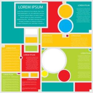
Your website should use a limited number of colors. A busy, rainbow effect will only detract from your message. Determine the color palette for your site and use the same colors on all pages. Select colors that complement your logo and graphics. Web designers Dallas TX usually choose one of three appealing color schemes. Monochromatic colors, various shades of the same color, are easy on the eyes. They’re a good choice when a company wants a more conservative look, but the designer should balance the shades evenly to prevent the site from becoming too static. Complementary colors offer a bold contrast since they’re opposite each other on the color wheel. Designers use them to emphasize a sales message, sale or call to action. Pleasing analogous colors are often found in nature. The red, yellow and orange shades found in autumn leaves are an example. They don’t offer much contrast and are less animated than complementary colors.
4. A Pleasing Overall Design
All the visual elements of your website – color, typeface, alignment and graphics – should blend together well. All site elements should follow a consistent theme. Skilled web designers Dallas TX use similar colors, banners and headers on all pages. They align graphics in a visually appealing manner and avoid mixing too many fonts in text. Professional designers know where to place contact information and social media icons on appropriate pages so they will be easily spotted by customers.
Any business looking for a more visually appealing website should contact the web designers at Osky Blue in Dallas. We offer a beginner’s web design packages that include a customized five page site, logo design and a built-in blog. Our other packages feature social media, PR and e-mail marketing. Contact us at (214) 494-8449 in the Dallas area or 866- 675-9411 toll-free for more details about our web design services.
Osky Blue | Web Designers Dallas TX | (866) 675-9411